
Six Pro Tips for a Great Giving Page to Boost Year-End Fundraising
Are you ready to launch your End-of-Year online fundraising campaign? Start by building a thoughtful giving page. Your giving page should aim to convert each visitor into a donor.
Your giving page always needs to reinforce the urgent need for support that you’ve conveyed in your appeal messaging. At the same time, it needs to establish your credibility, maintaining the trust you’ve gained through meaningful engagement.
So, what SHOULD your giving page look like?
Here are six tactics you can use so visitors want to make a gift.
6 PRO TIPS FOR A GREAT GIVING PAGE
1. Remove or limit navigation.
Hide or limit the links that can cause your visitors to click out of the page. Feel free to share additional information (i.e., links to other pages) on your thank you page.
2. Keep it short and straightforward.
Share enough information to persuade supporters to donate without confusing or overwhelming them.
- Use simple and clear language that explains what the page is about and exactly what you want the visitor to do.
- Organize your content so that it flows with your appeal message. For example, restating your campaign’s purpose can help remind prospective donors how they can help while keeping track of the main goal.
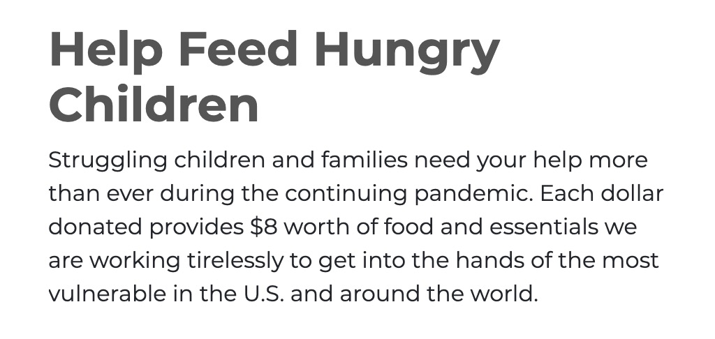
3. Use an actionable and value-driven headline.
The page headline should entice your visitors to complete the donation form.
- Use action-oriented words (e.g., Eliminate Hunger, Take Action, Get Involved), that remind the donor why they were compelled to donate in the first place.
- Present potential donors with a clear value proposition by briefly describing the impact of their support.
Feed the Children’s actionable and value-driven message
4. Make your page’s “submit” button text compelling.
Make the call-to-action (CTA) crystal clear by using a ‘Donate Now’ button. Your CTA, or the “submit” button, is one of the most powerful elements on the page. The text on that button can affect whether or not your visitor gives.
Try experimenting with different button text that could really seal the deal.
For example, instead of “submit” try:
- Donate Now
- Make a Difference
- Send Your Gift
- Support Mothers
- Save the Environment
- Give a Gift that Empowers.
- Help an Orphan Find a Forever Home.
These are just a few examples of compelling calls to action that remind people why their support is needed.
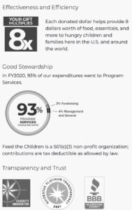
5. Use click triggers.
A click trigger is any message that’s positioned near a key call to action, with the sole purpose of compelling people to finally click the button. On a donation form, they can be an effective way to provide reassurance to the donor that they’re making the right choice.
For greatest impact, a click trigger should:
- Ease any anxiety that might cause your visitor to hesitate,
OR - Remind them of why they wanted to donate, what value your organization offers, and how they’ll feel by making a gift.
Here’s an example of a great click trigger on the Feed the Children giving site:
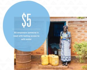
6. Add a compelling visual aid.
A picture is worth a thousand words. Even though you’ve explained what the fundraising appeal or campaign may be, include a graphic to show the visitor how their gift will impact the cause.
Here’s an image from Water.org:
Your giving page should remind your visitors of your compelling campaign purpose, so they become their own best motivator to hit that ‘donate’ button.
For maximum results for your year-end campaigns,
segment your prospect base with a DonorSearch screening.
GET A DEMO