
Use Drill-Down in Your Dashboard to Discover Your Best Prospects
Our last two posts on fundraising dashboards described the benefits and best practices for using data visualization to monitor and manage fundraising efforts. With charts, graphs, and images, dashboards summarize essential information about the strength of your fundraising efforts and your prospect pipeline.
QUESTION: How do you discover the best prospects in your prospect pipeline dashboard?
ANSWER: Drill down into the details of the dashboard ‘sweet spot’
2 steps for prospect dashboard drill-down
Step One – Look for the ‘sweet spot’.
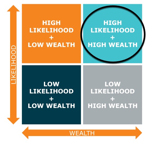
A prospect pipeline dashboard will show you your prospect pool in a graph that compares two important variables on the ‘X’ and ‘Y’ axes–like Wealth and (Giving) Likelihood ratings. The group of prospects that are in the High-Likelihood + High Wealth quadrant is the sweet spot of your pipeline.
Step Two – Drill Down to the Detail.
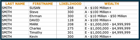
A good prospect pipeline dashboard will be interactive. That means you should be able to point and click on the ‘sweet spot’ of the graph to reveal the names of your best prospects underneath!

What’s Next?
As you can see, drilling down on the sweet spot will quickly show you the prospects with the greatest potential. So here are three next steps that will take you closer to closing your biggest gifts:
- Learn more about each prospect by looking at their system record for gift histories, affinities, engagement activities, and other profile information.
- Add their names to your prospect portfolio.
- Contact the prospect and begin cultivation.
How to Make Your Dashboard’s Sweet Spot Sweeter
A Dashboard is a powerful tool for analyzing a lot of data and visually making actionable insights obvious. In order to make your view of the sweet spot more precise, consider the following:
- Incorporate more interactive functionality*.
Add the ability to use other data points to the graph so that you can fine-tune the high-wealth/high-likelihood list by additional variables, like demographics, interests, and experiences.
*Data Visualization software like Tableau can do this easily. - Add screening data and analytics to the underlying data tables.
Screen your prospect and donor base and use the results, like net worth ratings, loyalty scores, charitable giving histories, etc. to feed your view of the sweet spot.
Drill down to the details behind your dashboard’s data visualization, and you will strike the pool of your best prospects.
Have you heard about DonorSearch Ai? It’s the revolutionary product that harnesses the processing power of AI/machine learning to deliver interactive data visualizations that show you your strongest fundraising opportunities.
GET A DEMO